UniMelb Search
Streamlining search at the University of Melbourne
UX/UI • Web Feature

The University of Melbourne was looking to improve its search experience after receiving consistently poor user feedback. It was evident that the existing search functionality fell short, lacking refinement options and readability. With over 100 sites in its ecosystem, the search needed to better assist users in finding relevant information.
Client
University of Melbourne
Contributions
UX design, UI design, user testing
Year
2020-2021
UniMelb Search
Streamlining search at the University of Melbourne
UX/UI • Web Feature
The University of Melbourne was looking to improve its search experience after receiving consistently poor user feedback. It was evident that the existing search functionality fell short, lacking refinement options and readability. With over 100 sites in its ecosystem, the search needed to better assist users in finding relevant information.
Client
University of Melbourne
Contributions
UX design, UI design, user testing
Year
2020-2021
Discovery
Redesigning UniMelb search for better usability
The previous search layout buried key details within long paragraphs and had limited filtering options, making navigation difficult. Our goal was to improve usability by redesigning the layout to make search results more scannable and intuitive while also aligning with the new design system style.
Process
The approach to redesign
We adopted a user-centered approach to redesign the search feature, combining insights from competitor research with iterative design and testing for a more intuitive experience.
Process
The approach to redesign
We adopted a user-centered approach to redesign the search feature, combining insights from competitor research with iterative design and testing for a more intuitive experience.
Process
The approach to redesign
We adopted a user-centered approach to redesign the search feature, combining insights from competitor research with iterative design and testing for a more intuitive experience.
Process
The approach to redesign
We adopted a user-centered approach to redesign the search feature, combining insights from competitor research with iterative design and testing for a more intuitive experience.
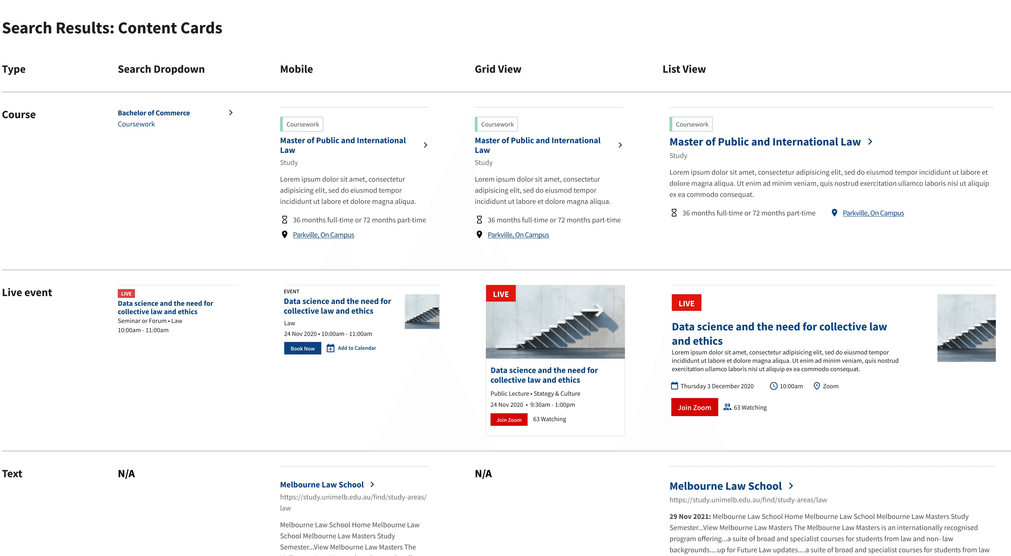
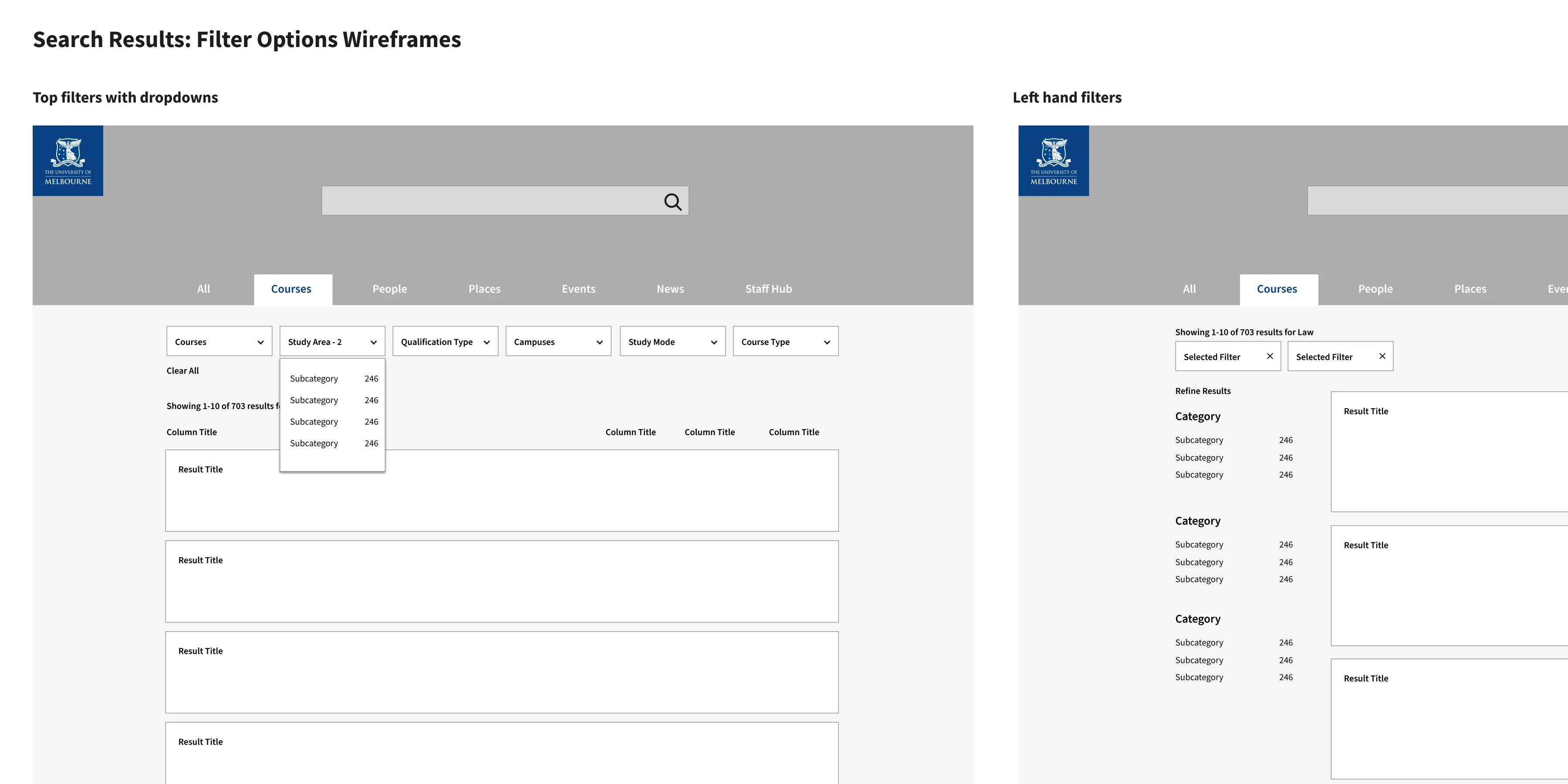
Result types
Researching and designing components
Building on the team’s research into user segments and personas, I focused on redesigning the search feature for better usability. This included analysing other universities' search features, products utilising the Squiz search platform, and general search patterns to identify best practices and features suitable for UniMelb. The redesign heavily emphasised establishing style consistency across multiple result types while enhancing key features specific to each type, such as iconography for course locations and event times. Given the varied content types and potential for incomplete information, I planned for different copy lengths and ensured the design was adaptable across multiple devices and views.
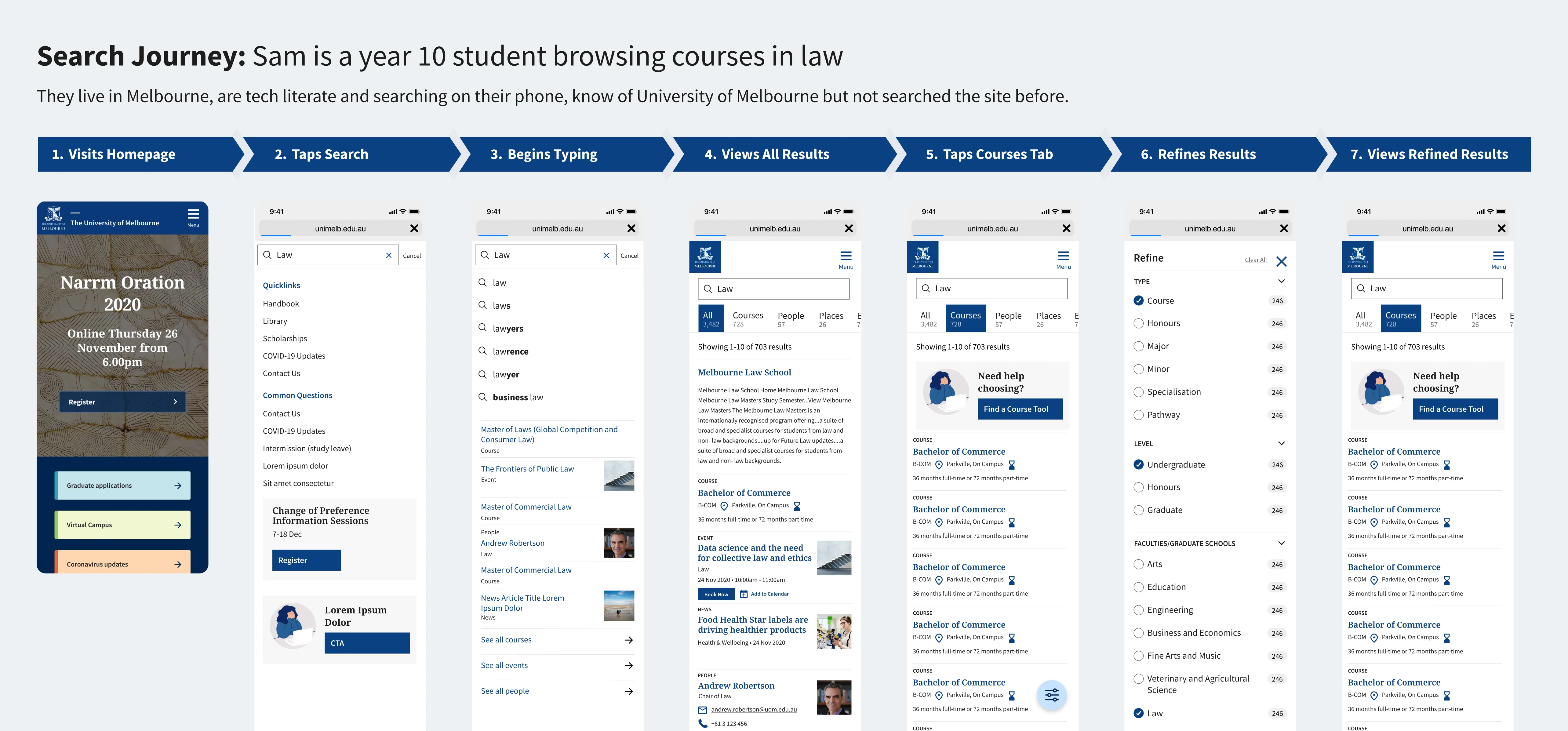
User journeys
Journeys for every user
I created journeys for each of our core users, from prospective students searching for new courses, existing students looking for help or visitors looking for the right building on campus.
User journeys
Journeys for every user
I created journeys for each of our core users, from prospective students searching for new courses, existing students looking for help or visitors looking for the right building on campus.
User journeys
Journeys for every user
I created journeys for each of our core users, from prospective students searching for new courses, existing students looking for help or visitors looking for the right building on campus.
User journeys
Journeys for every user
I created journeys for each of our core users, from prospective students searching for new courses, existing students looking for help or visitors looking for the right building on campus.
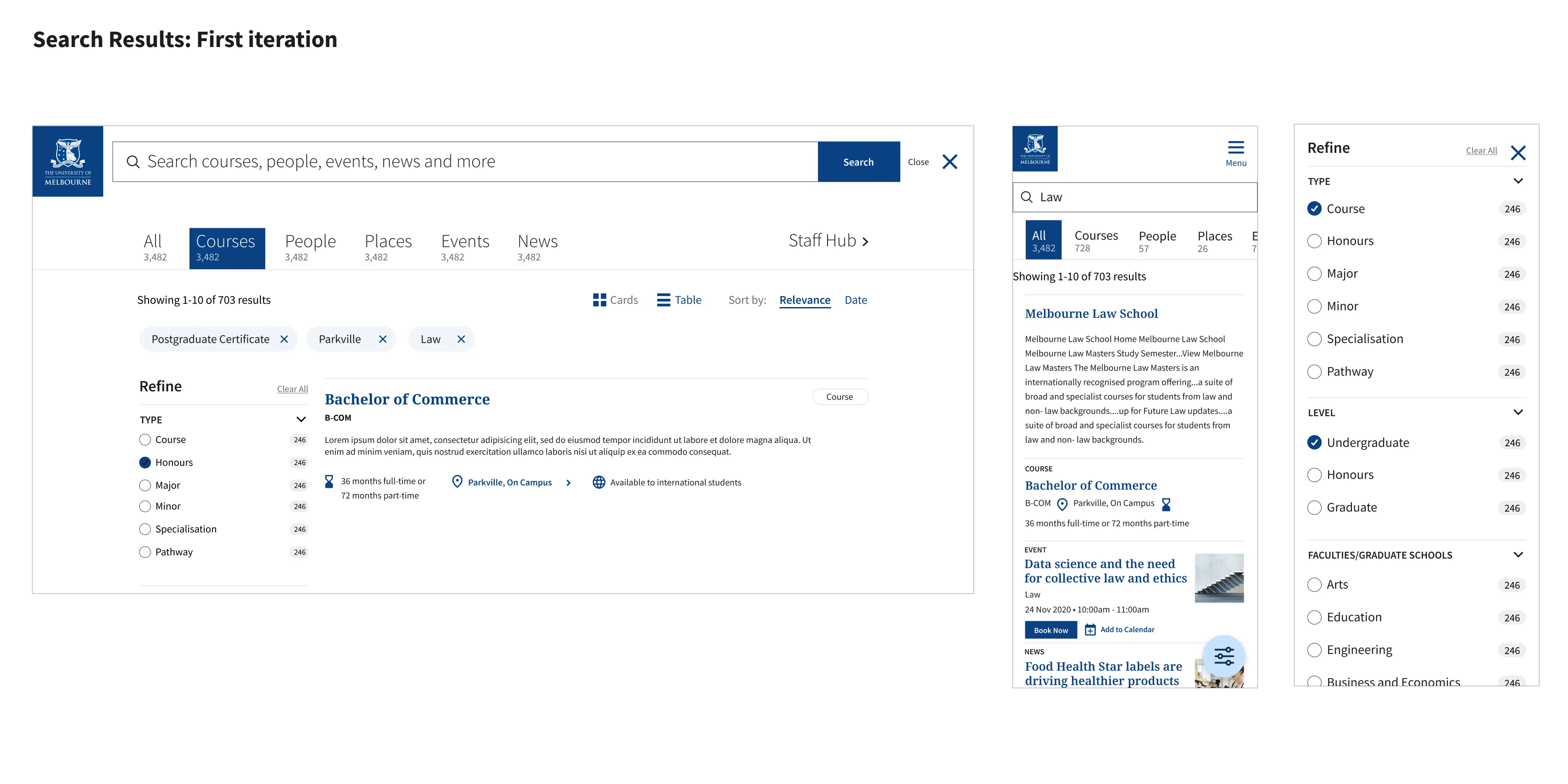
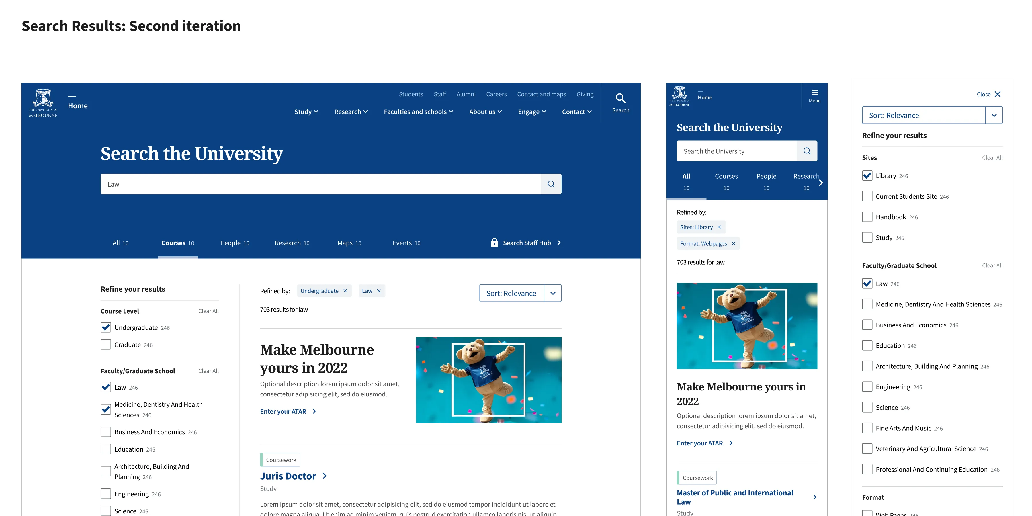
Design exploration
Iterative designs and concepts
I worked through stages of wireframes, initial design concepts for user testing and further refined design after gathering feedback. The designs aligned with some wider redesign that was in progress and with the UniMelb design system, utilising components from Storybook and the Figma UI Kit where possible.
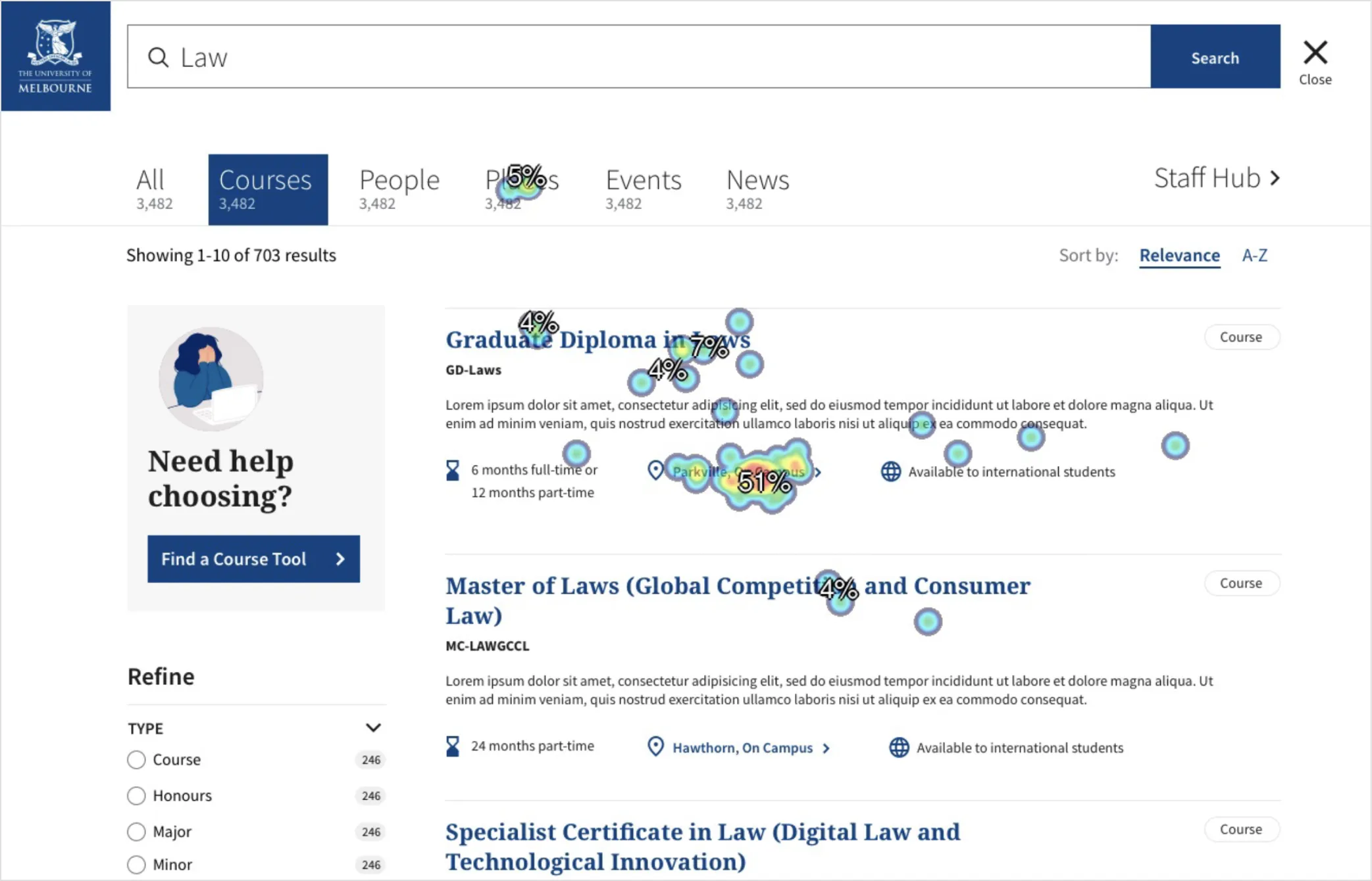
User testing
First click testing with 60 students
We tested the new features from early designs with 60 students, using Optimal Workshop's First Click Test to validate the usability enhancements and refined any problematic areas.
User testing
First click testing with 60 students
We tested the new features from early designs with 60 students, using Optimal Workshop's First Click Test to validate the usability enhancements and refined any problematic areas.
User testing
First click testing with 60 students
We tested the new features from early designs with 60 students, using Optimal Workshop's First Click Test to validate the usability enhancements and refined any problematic areas.
User testing
First click testing with 60 students
We tested the new features from early designs with 60 students, using Optimal Workshop's First Click Test to validate the usability enhancements and refined any problematic areas.
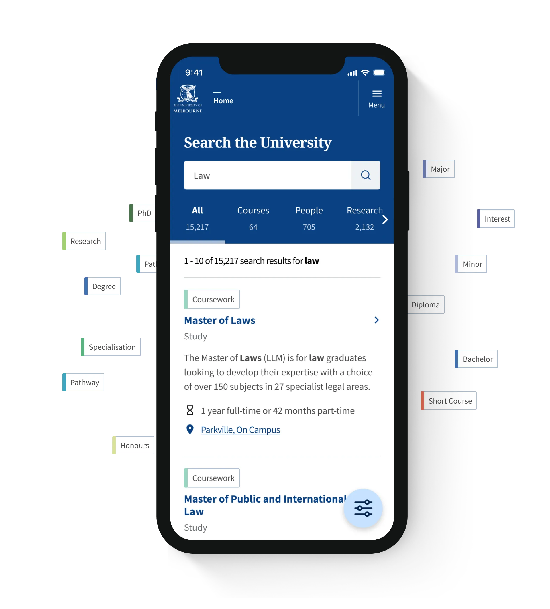
Design & UX Enhancements
New search features
Design & UX Enhancements
New search features
Design & UX Enhancements
New search features
Design & UX Enhancements
New search features

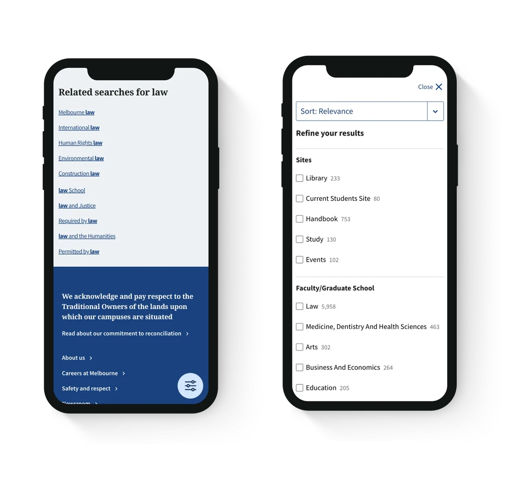
Enhanced autocomplete for quicker search results
I enhanced the autocomplete dropdown to not only display suggested keywords but also direct results like related courses and people. This reduced the number of steps needed to find information, allowing users to click straight through to their desired page from the search bar.
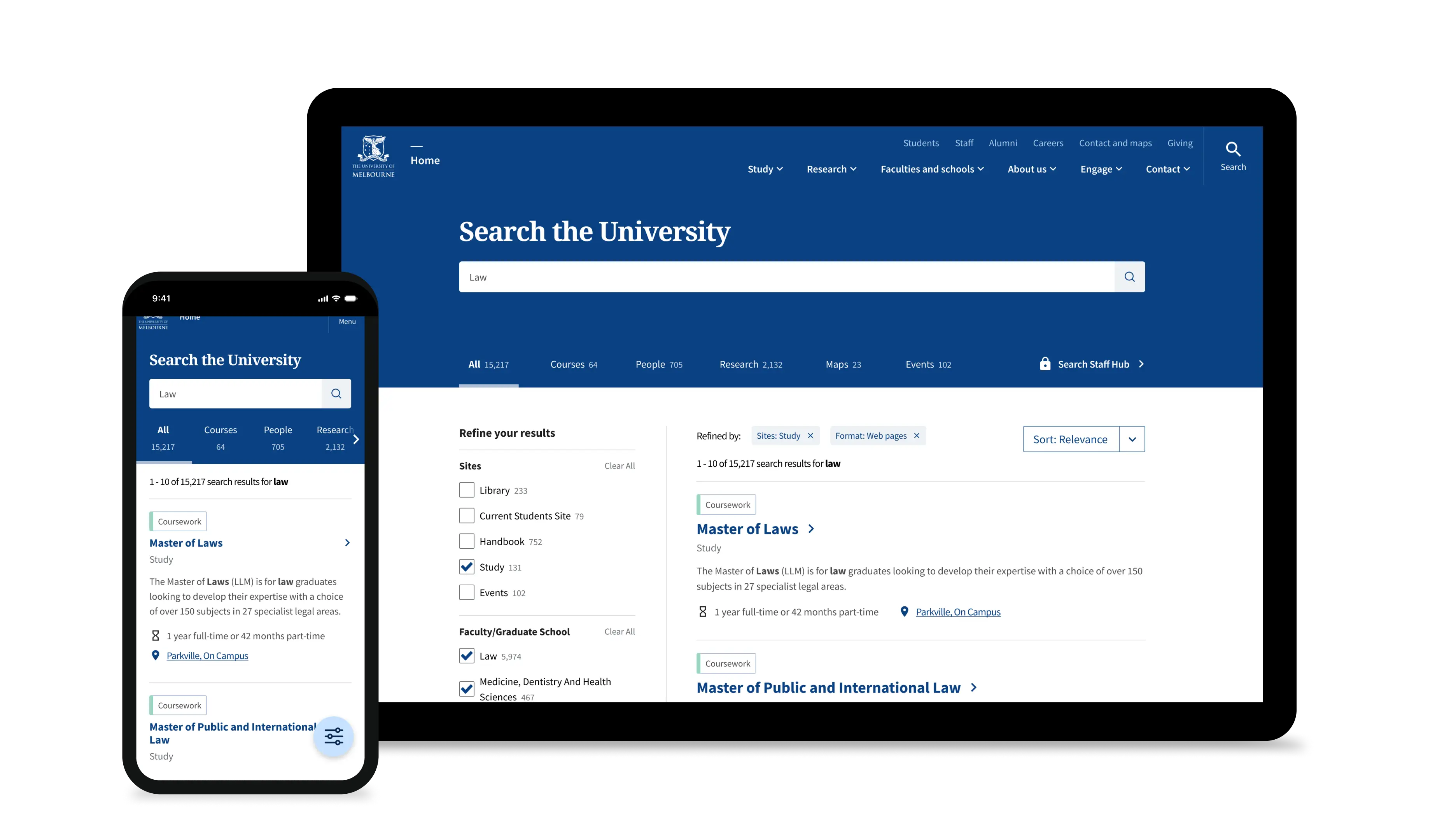
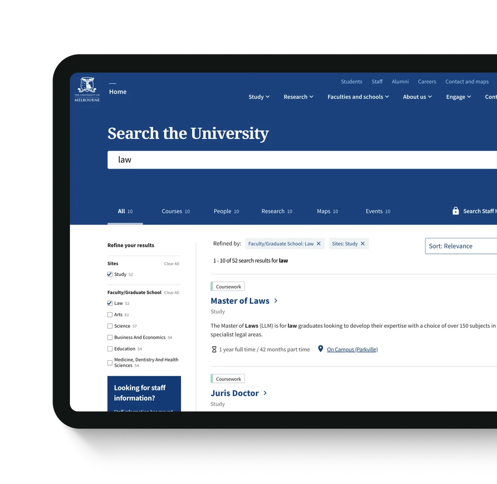
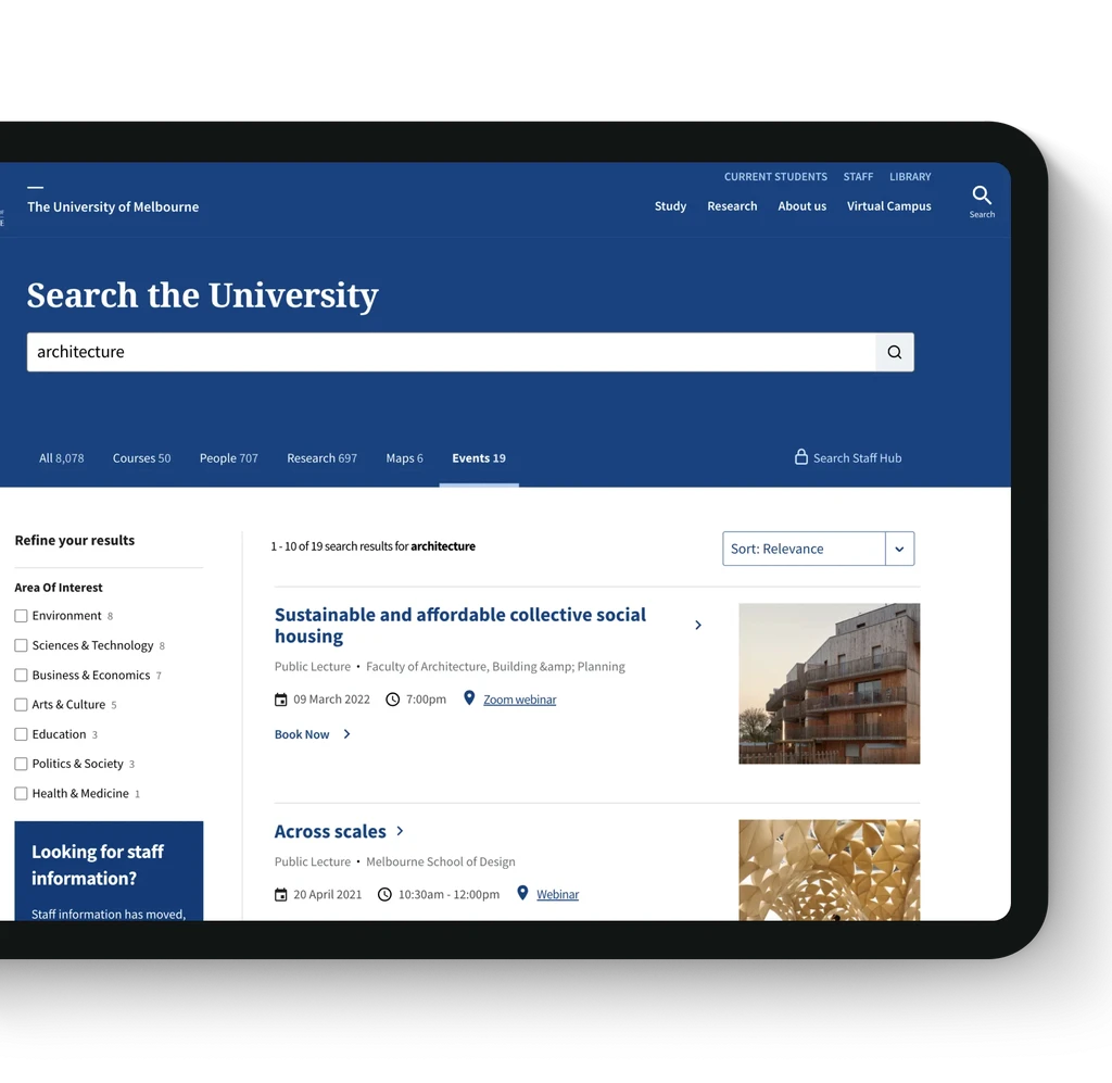
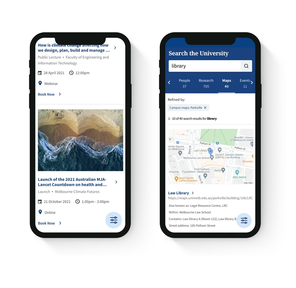
Making search results easier to scan
Previously, search results were displayed as plain text, making it difficult for users to find what they needed. I introduced colour-coded course tags aligned with the course handbook, making it easier to identify course types at a glance. Additional enhancements like icons and clickable campus locations provided clear, scannable details, helping prospective students navigate course options and campus information more efficiently.
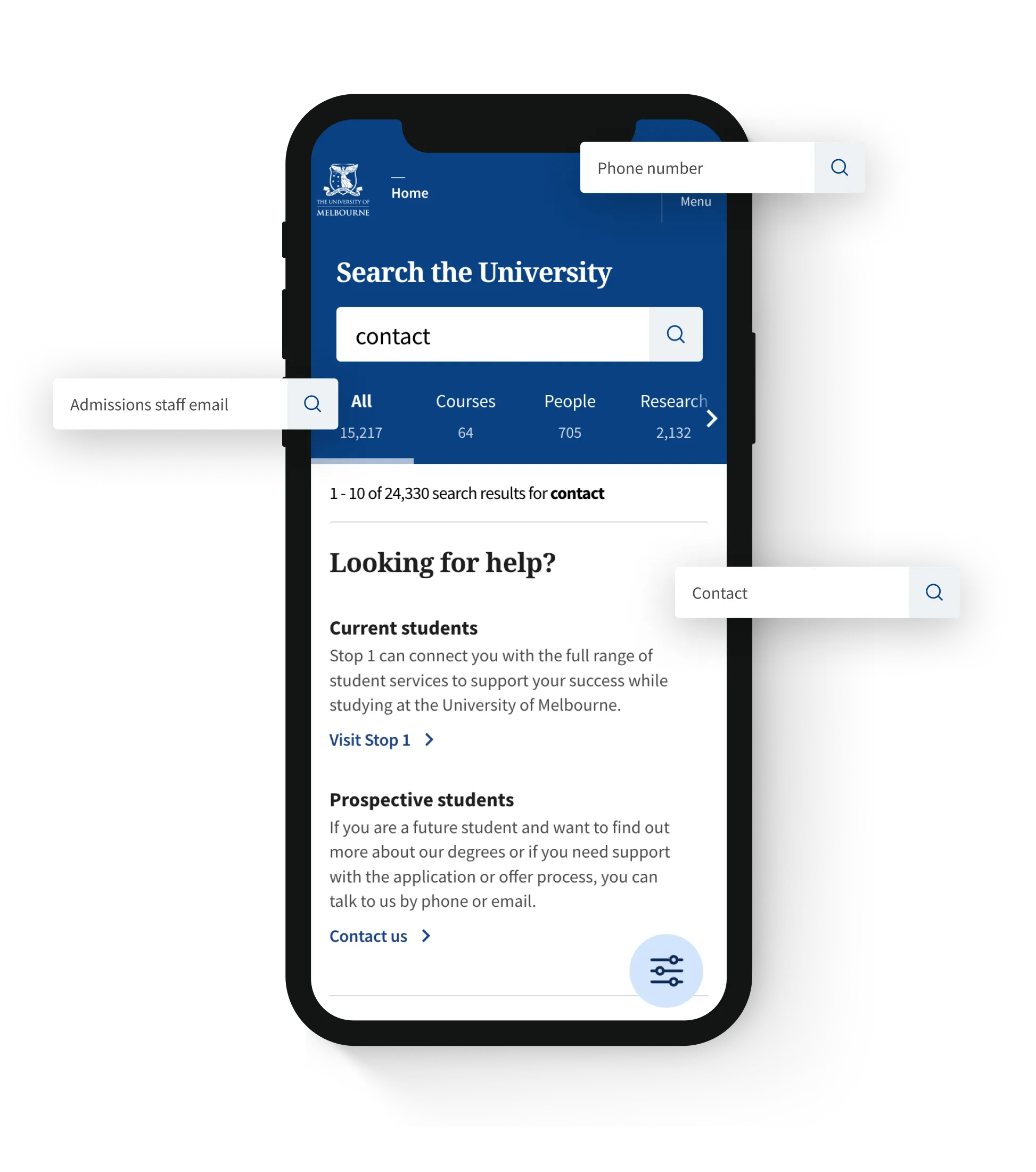
Guiding enquiries with promoted search results
To address a recurring issue where students searched for individual staff emails instead of using proper enquiry channels, I implemented promoted custom results. For keywords like 'contact,' users are now directed to the appropriate contact methods, ensuring enquiries reach the right department. This feature also allows marketing to highlight specific content for other keywords, making it a versatile tool for promoting important information.
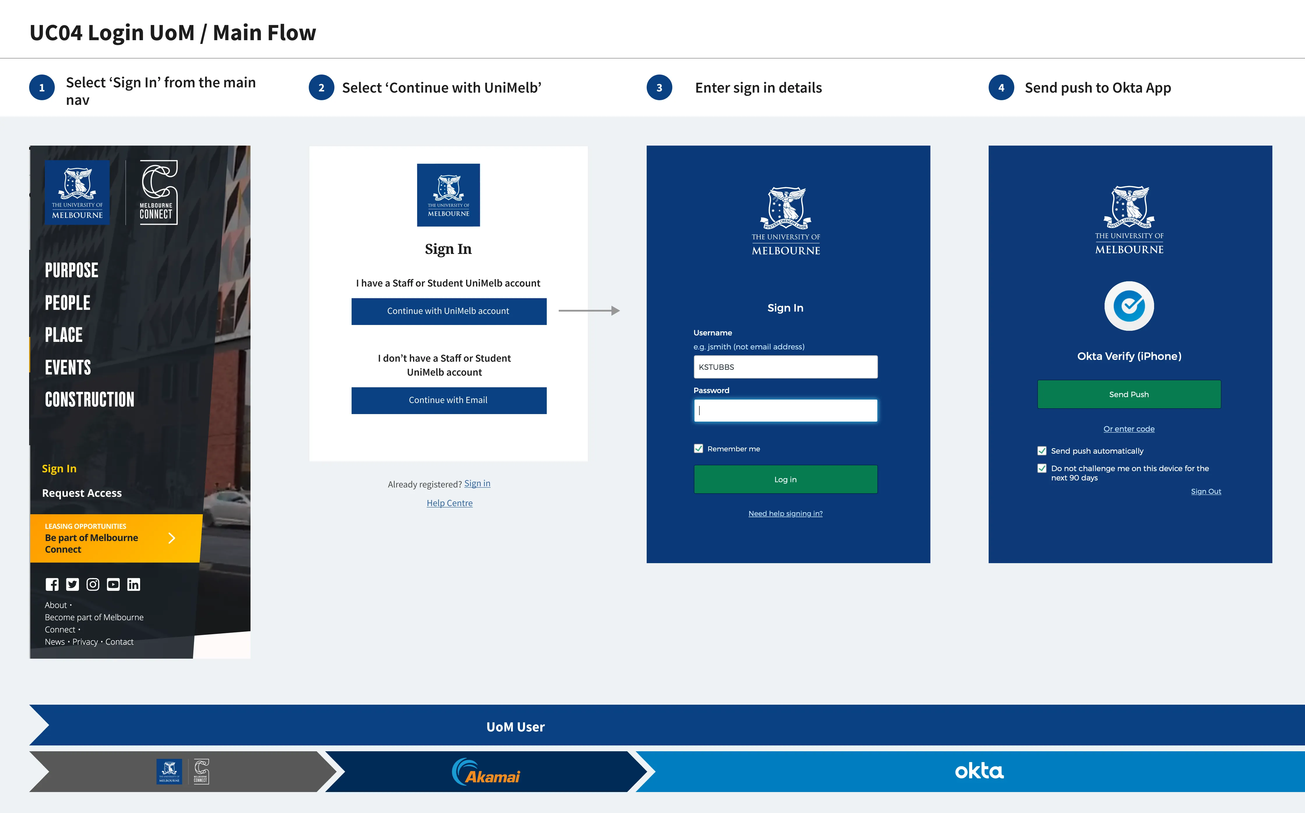
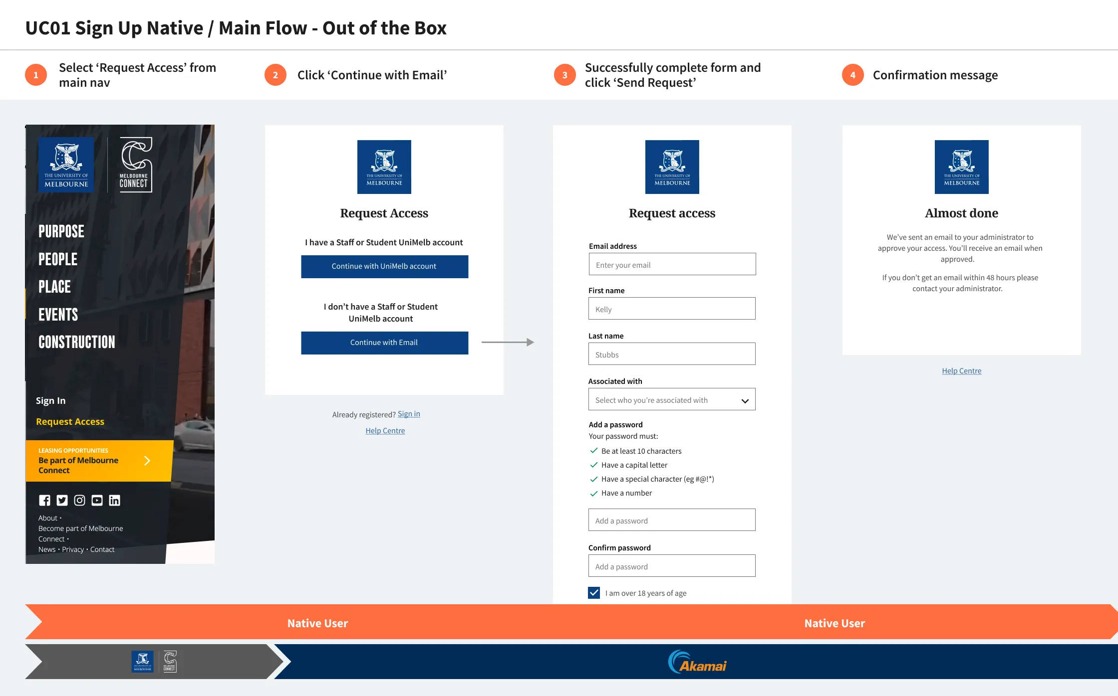
UniMelb ID
Implementing a new sign in for UniMelb
In addition to search I worked on a couple of other notable projects with UniMelb including the rollout of the new digital ID. I worked closely with a Business Analyst to map user journeys for every use case, such as new students and staff members. This involved outlining each step of the process and determining how the Akamai solution would integrate with staff Okta accounts and individual University websites. Additionally, I provided style guides to customise the white-labeled Akamai screens, ensuring they aligned with the University of Melbourne's branding while maintaining usability.
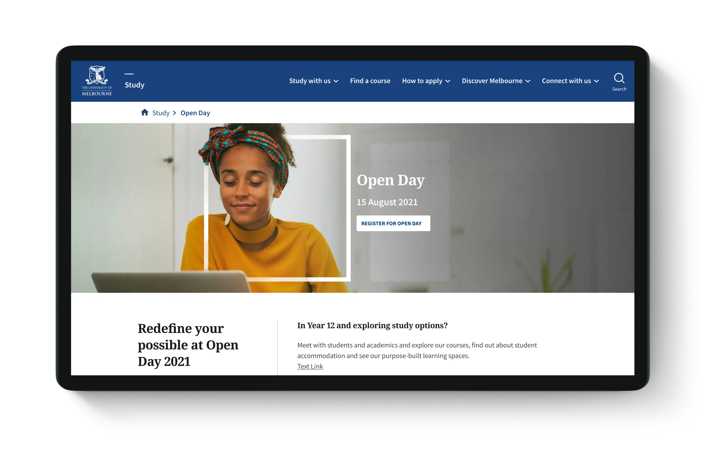
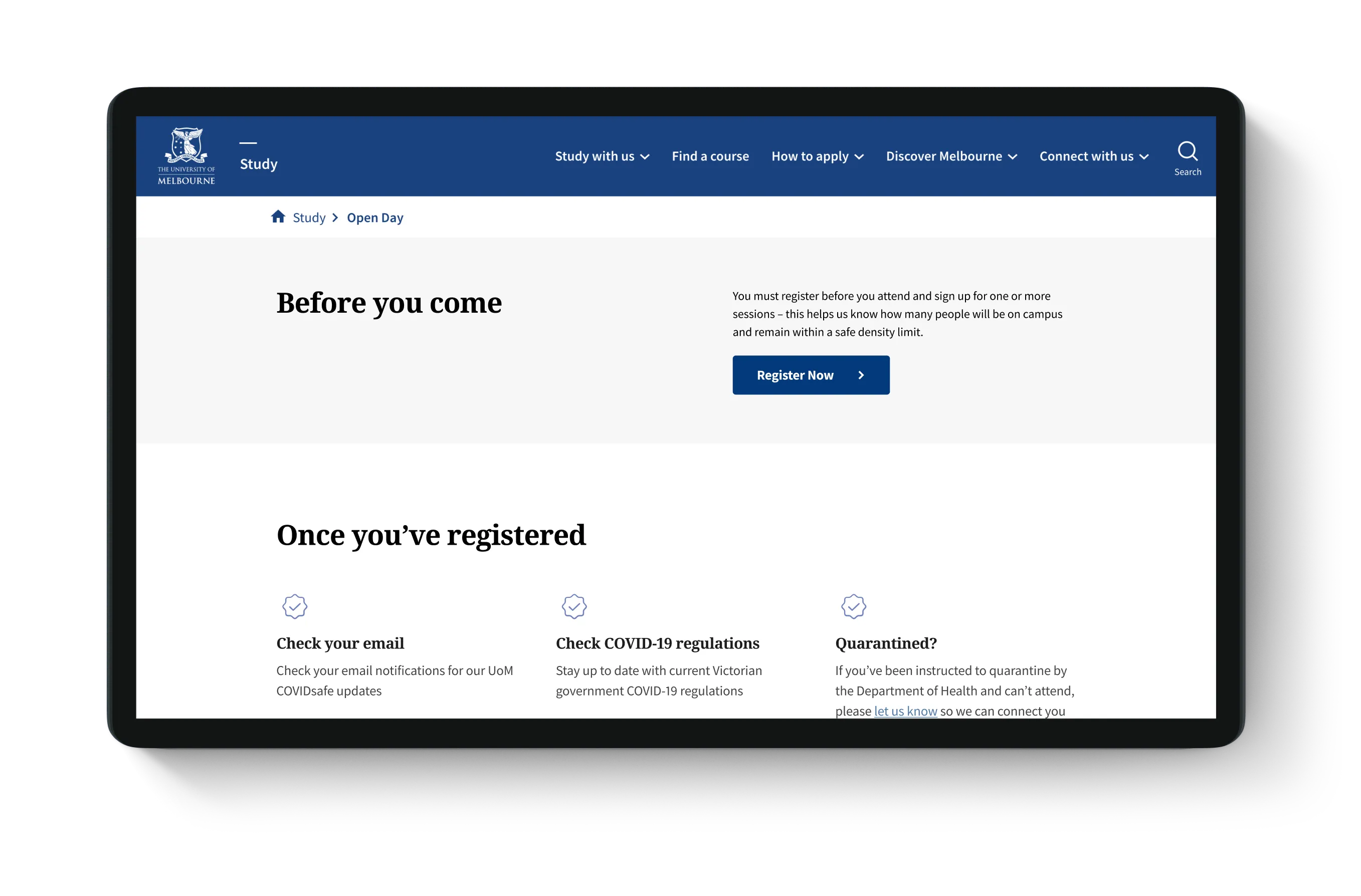
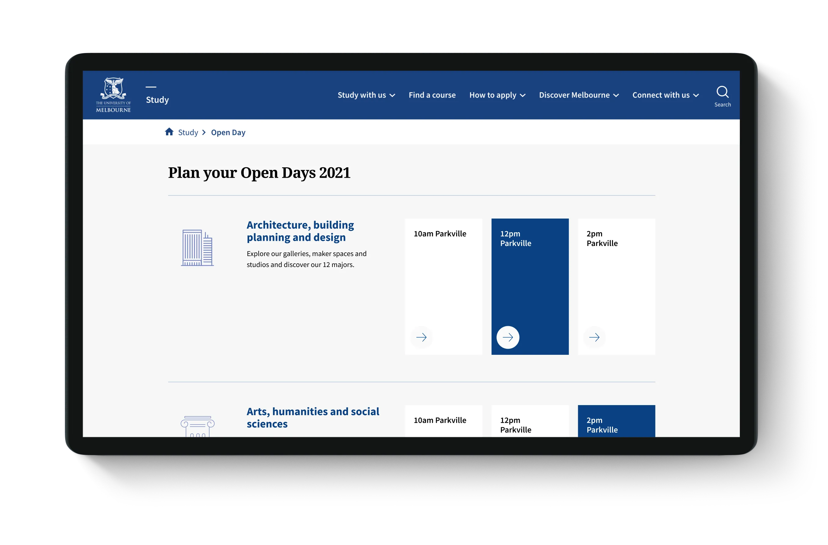
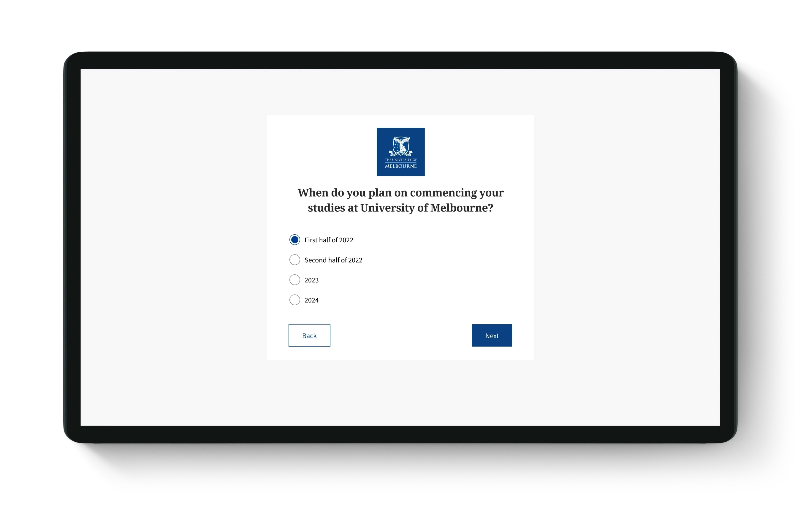
Open Day
A rapid microsite for Open Day
I designed a microsite for Open Day. This fast-paced project involved designing landing and detailed information pages, integrating the new UniMelb ID and creating a multi-step form to gather information about prospective students. The form captured details such as whether they were a parent or student, the courses they were interested in, and their intended start date for study. To bring this together quickly, I utilised the University of Melbourne Design System's Storybook components and collaborated closely with the website content administrator for implementation.
Final thoughts
Refining the search experience and beyond
The redesign successfully streamlined the search experience, making it faster and easier for students to find relevant information. It’s rewarding to see this work still live on the University of Melbourne website today, albeit with some evolution to match their updated brand. This project was a great opportunity to contribute to meaningful and lasting improvements within a larger organisation, balancing the use of established structures with the flexibility to adapt to specific challenges.
More Case Studies


More Case Studies
More Case Studies

More Case Studies


Let's collaborate.
Kelly Stubbs © 2025
I acknowledge the Wurundjeri people as the Traditional Owners of the Kulin Nation on which I live, work and create.
Let's collaborate.
Kelly Stubbs © 2025
I acknowledge the Wurundjeri people as the Traditional Owners of the Kulin Nation on which I live, work and create.
Let's collaborate.
Kelly Stubbs © 2025
I acknowledge the Wurundjeri people as the Traditional Owners of the Kulin Nation on which I live, work and create.
Let's collaborate.
Kelly Stubbs © 2025
I acknowledge the Wurundjeri people as the Traditional Owners of the Kulin Nation on which I live, work and create.